
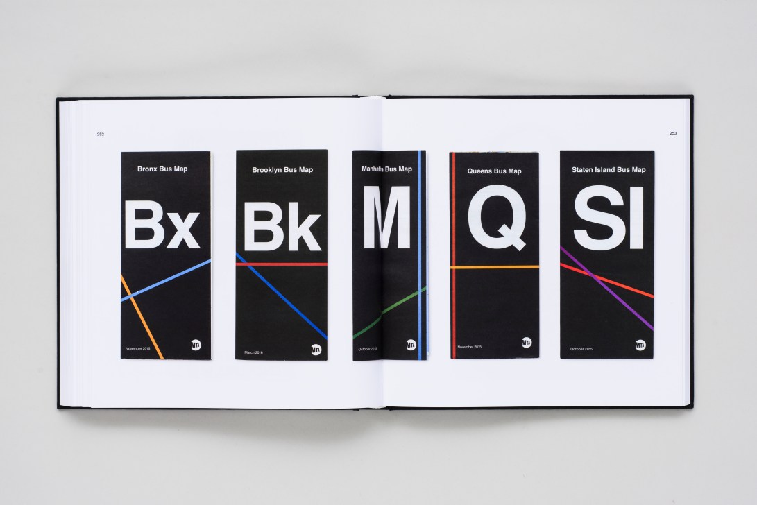
In 2011, photographer and New Yorker Brian Kelley started collecting MetroCards from the city’s subway system. Fascinated by the nuanced variations in design of this simple everyday urban object, he began documenting them and expanding his collection to include other artefacts from the public transport system, from the present day and stretching into history.
His growing archive of objects was shared on Instagram (@the_nycta_project), positive treasure trove of the design history of the city’s transport, and has now been made into a fascinating book, published by Standards Manual. From tickets and maps to the materials used by transit staff, it showcases (through approximately 400 objects) the design of everyday life that may often be overlooked and which yet is entirely distinctive of New York and its transport, particularly through the use of helvetica that – along with many other graphic design aspects – formalised in use through the 1970 New York City Transit Authority Graphics Standards Manual.
Below is a short taster of the archive – but head to the Instagram page or buy the book to explore it in all its glory.


New York City Transit Authority: Objects is published by Standards Manual
